Have you ever wanted to know how to create the best flat-lays? Today we’re sharing our styling tips and favorite tools to use when creating the perfect flat-lays for your clients (and yourself!)
What to Use For the Background
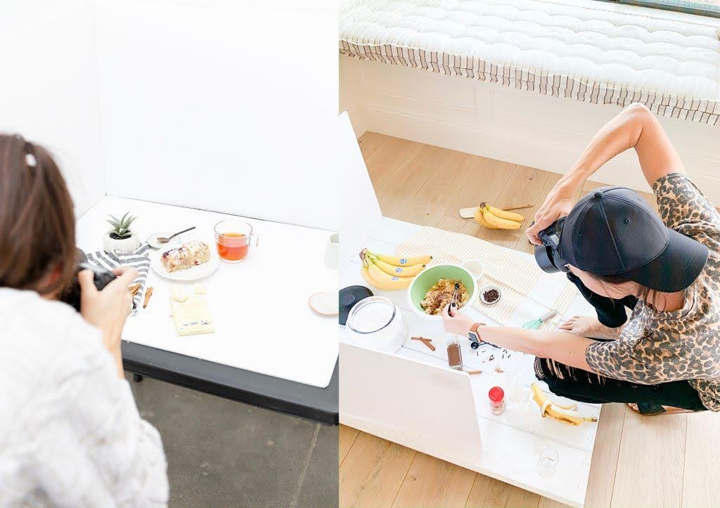
First things first, if you aren’t using white foam boards, you need to add them to your next dollar store, office store, or Target run because these things are gold when creating flat-lays.
(Side-note: Check the dollar store first! I love that I can find these at the dollar store, but sometimes they’re already all rippled for some reason and have a “wavey” look to the board, rather than a smooth surface. If you run into that too, check Target, Walmart, or an office store.)
White foam boards are like a white poster board but they’re much thicker which provides a sturdy foundation for styling on. And with the smooth white surface of it, they provide the cleanest white background for any photo you need to create.
They’re double-sided so you basically get two styling boards in one 🏆, they’re perfect for standing up and creating a light box so that light bounces off of them and back onto the flat-lay you’re creating 🏆🏆, and because they’re double-sided you don’t have to be afraid to intentionally spill, draw, or make a mess when you’re getting creative 🏆🏆🏆! (We’ll talk more about creative messes soon – they’re my favorite!)
Okay so now that you know what to use for your background and where to find them, let’s talk about my top three favorite tools I use when styling flat-lays.
Favorite Tools for Flat-lays
1. GAFF TAPE
To put it simply – this stuff has the strongest hold, while also being easy to peel off without all the sticky residue. Whether you need it to form a light box and tape white foam boards together around your flat-lay, or you need it to fold and stick under an object or prop to hold it in place for the photo, this is our favorite tape that we use for almost every branding session.
2. ACRYLIC STYLING BLOCKS
When you want to create dimension and height separations within your flat-lay, these clear acrylic styling blocks are great to use. They create the perfect height difference by giving just the right amount of lift to whatever prop or product you’re working with, and they’re clear which is a photographer’s best friend! I also love that you can get them in square and circle shapes so that you have both options based on the shape of the product or prop you’re working with.
3. EXPODISC
Truthfully, there’s not a session we start shooting without our ExpoDisc. This is the professional white balance filter we use every single time to nail skin tones, true whites, and true colors within our images. So when you’re creating flat-lays on a white background this guy will set you up for success and save you time editing color during post-processing. You can snag an ExpoDisc here and save 10% when you use checkout code ‘ERICAANDJON10’
3 Styling Principles to Level Up Your Flat-Lays
Now that you know the top 3 tools I use when creating flat-lays, I want to tell you about my top 3 styling principles that are guaranteed to level up your flat-lay images.
I should tell you that my brain works a little differently and my approach to creating an image starts with the end in mind.
I start by envisioning the final photo and how I want it to look. I get a picture of that in my head and then I get to creating what I’m seeing.
One of my favorite hobbies in high school and after our son was born, was scrapbooking and I used this exact approach when I would scrapbook.
I would look at the photos I was going to create a page for (think of this as your products or the main focus of the photo you’re creating and shooting for) and think of what I wanted the final page to look like (think of this as your final image) and then I’d style away. 👇👇
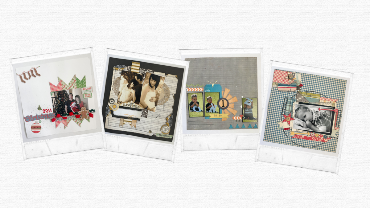
It worked every time!
Call it backwards or call it weird, but seeing what I wanted the end result to look like in my head served as my mental instructions for how I would begin to style.
Over the years, I’ve determined a few styling tips that work no matter what it is you’re styling for.
TIP #1 – START WITH YOUR ANCHOR.
Let’s forget scrapbooking now and focus 100% on brand photography – your anchor is most often your largest item. Whether that item is a prop or the focus of the image (ie: your client’s product, the food you’re photographing, etc.) start with that item and base all of the other styling you do around that main focal point.
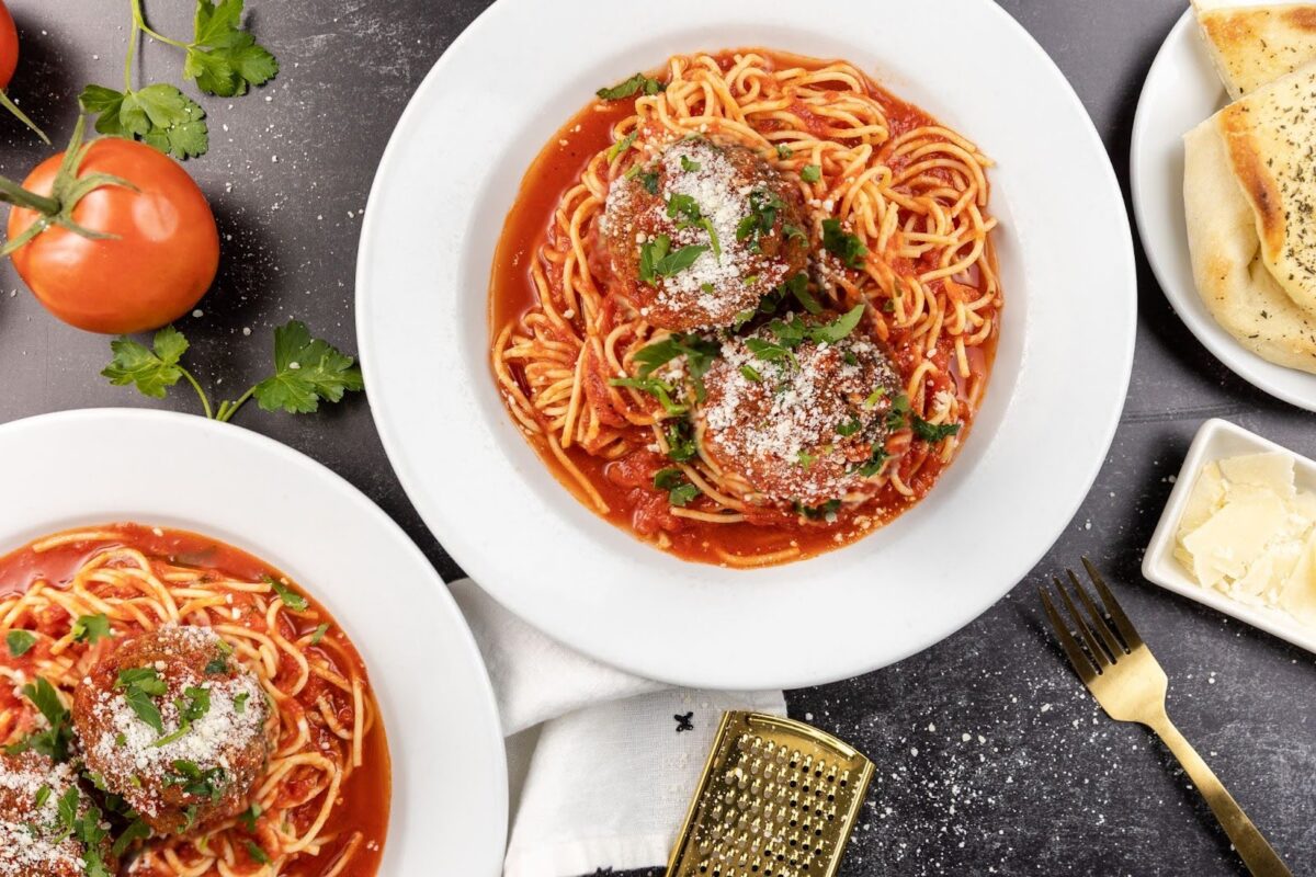
In this example we shot for a restaurant, the bowl of spaghetti and meatballs is the anchor in this image, and everything else is built out around it.
TIP #2 – STYLE IN ODDS.
Odd numbers have been scientifically proven to be more interesting and eye-catching than an even amount of things. If you’re creating an office themed flat-lay for your client, use a group of 3 or 5 paper clips falling off a notebook instead of 4.

TIP #3 – MAKE A MESS.
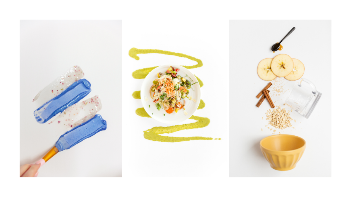
The spills (accidental or not), the sprinkling of a complimentary element (ie: sprinkling cinnamon high above your white foam board, counter, or table to add in that picture-perfect messy layer), or the smearing of paint or a product (ie: a lotion or face wash) to add in some texture to the flat-lay and an interesting visual element; is what will make your final photo pop and come to life!
This is the game changer in taking a “flat” image that’s boring and bland and bringing it to life in a way that causes a person to stop and look a little longer. Also, the goal is for that person being your client’s ideal client, because that’s who they’re intended to market their business to after all.
Bonus Tips!
Here are 3 more bonus tips for your next flat-lays!
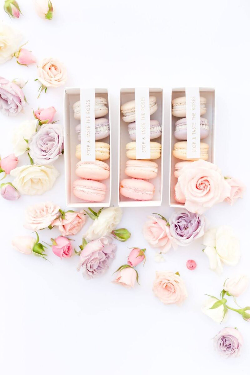
- Toss; don’t place. The more random and unintentional, the BETTER.
- To create even more visually interesting photos; let your props and styling run out of the frame in the final image you create.
- Utilize leading lines. Consider where you want the attention to be given in the flat-lay you’re creating (this would be whatever it is that you’re highlighting for your branding client) and draw in the viewer’s eyes with leading lines pointing at the main focus of the photo.
There you have it!
Implement these tips the next time you create flat-lays and watch your final images come to life.
Comments +